The Greatest Formula 1 Liveries Ever Designed

White

The Greatest Formula 1 Liveries Ever Designed

5 March, 2026

Words by:

Justin Jackie

How colour, sponsorship and design turned race cars into some of the most recognisable objects in sport.

There are seasons when Formula 1 feels like mathematics. And there are seasons when it feels like theatre.

With Audi and Cadillac joining the grid, a Newey-shaped Aston Martin emerging under fresh regulations, and a field of 2026 cars that look genuinely resolved again, Melbourne does not just mark the start of a championship. It feels like the start of a visual chapter.

Before the lap times settle and the midfield reshuffles itself into something predictable, something else registers.

The cars look good.

That matters more than we admit.

Formula 1 has always been engineering first. But it has also been one of the most quietly influential design platforms in modern culture. Every season, around twenty sculptural objects travel the world, broadcast into living rooms, clipped into highlight reels, reposted into mood boards. They carry colour, typography and identity at 330 kilometres per hour. They shape what speed looks like.

A livery is not decoration. It is posture. It is how a team chooses to exist in public.

For much of its early history, Formula 1 cars were painted according to nationality rather than sponsorship. Italian teams ran in Rosso Corsa. British entries wore deep green. French machines carried blue. German cars, famously, ran in bare aluminium, giving rise to the Silver Arrows. The grid was less a collection of brands and more a procession of national colours in motion.

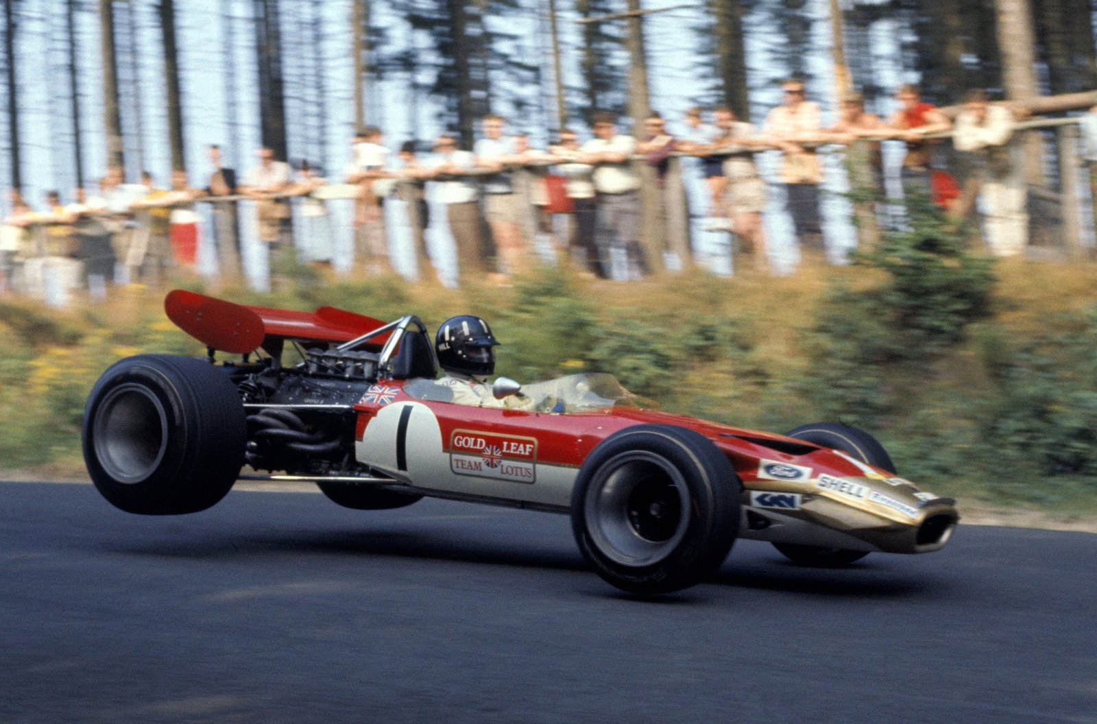
That tradition began to shift in 1968.

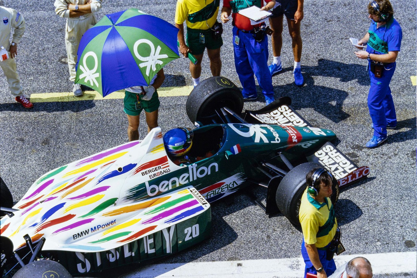
At the Spanish Grand Prix, Team Lotus arrived not in British Racing Green, but in the red, white and gold colours of Gold Leaf Tobacco. It marked the first time a major commercial sponsor dictated the appearance of a Formula 1 car. The move was met with mixed reactions. Some viewed it as the erosion of heritage. Others saw it as an inevitable evolution in a sport becoming increasingly global and commercially viable.

What followed was not merely a change in funding structure, but a transformation in visual language. Sponsorship did not simply add logos. It introduced palettes, typography and graphic hierarchy. The Formula 1 car ceased to be a national emblem and became something more complex, a moving expression of brand identity shaped as much by design as by engineering.

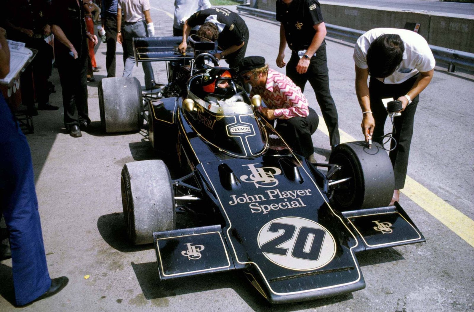
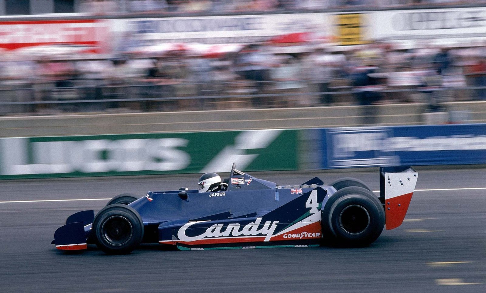
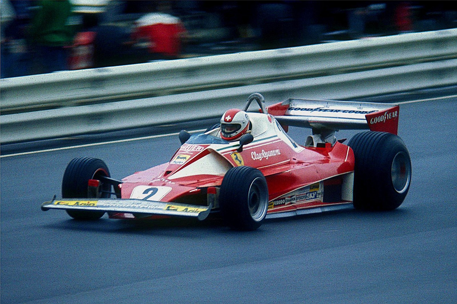
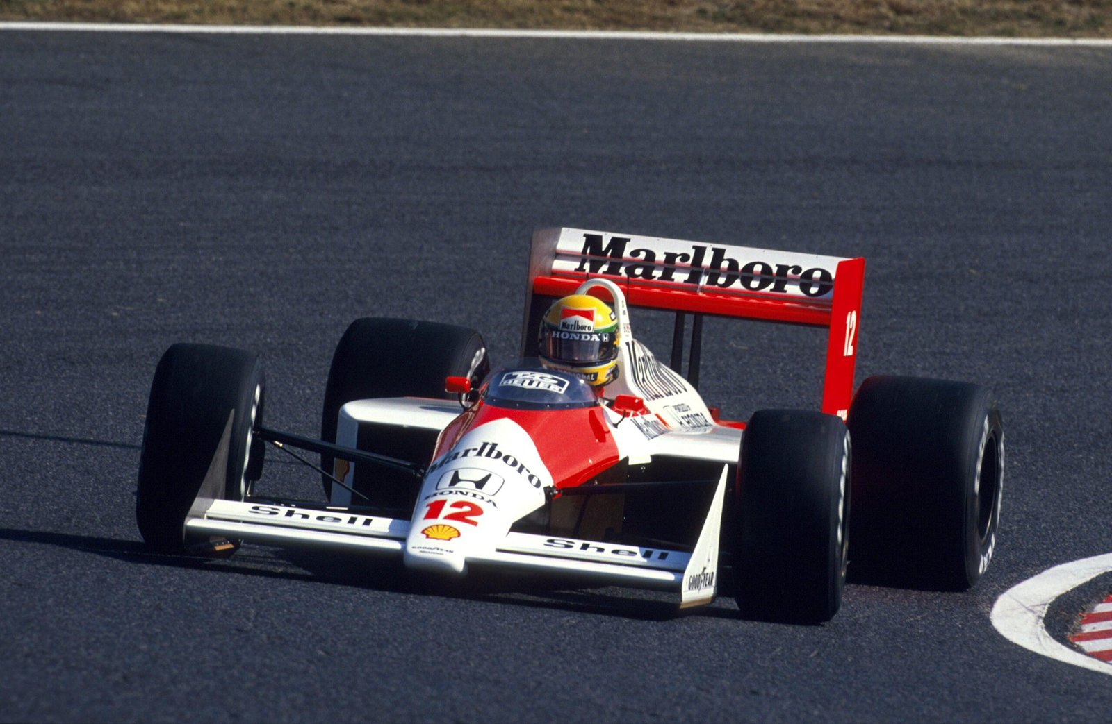
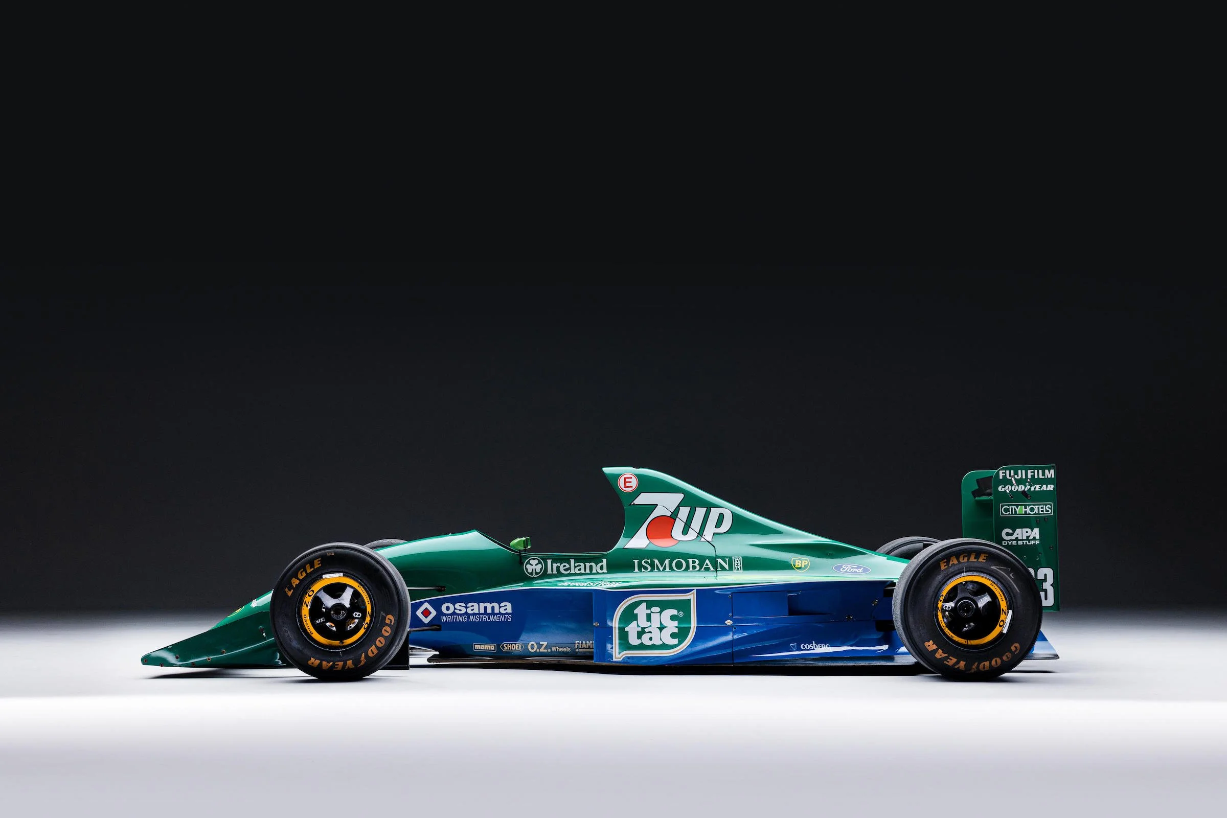
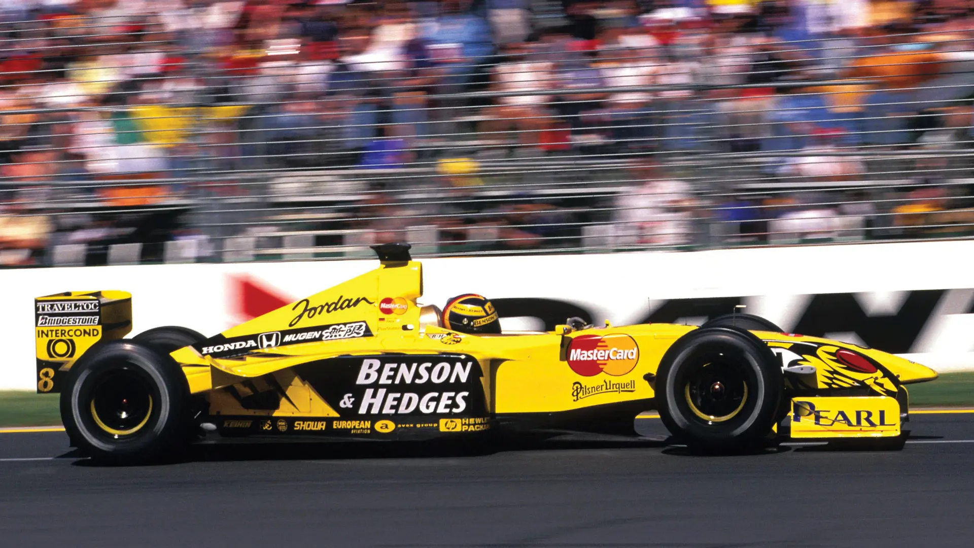
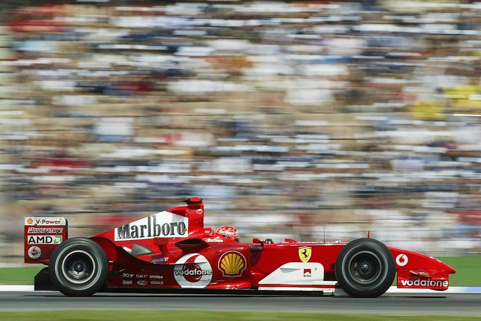
It is tempting to believe the most beautiful Formula 1 cars belong to another era. The black and gold Lotus glowing under Monaco floodlights. Marlboro red and white cutting through harbour-side smoke. The almost radioactive brightness of a Jordan in 7UP green during the early satellite television boom. We associate those machines with danger, glamour and a time when the sport felt less mediated.

But nostalgia tends to simplify.

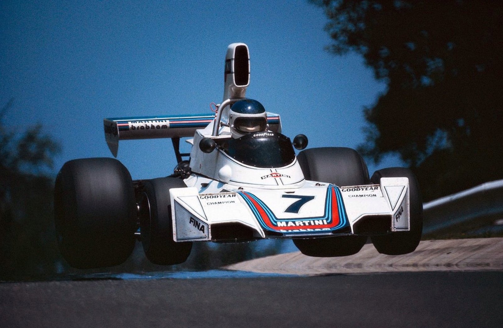
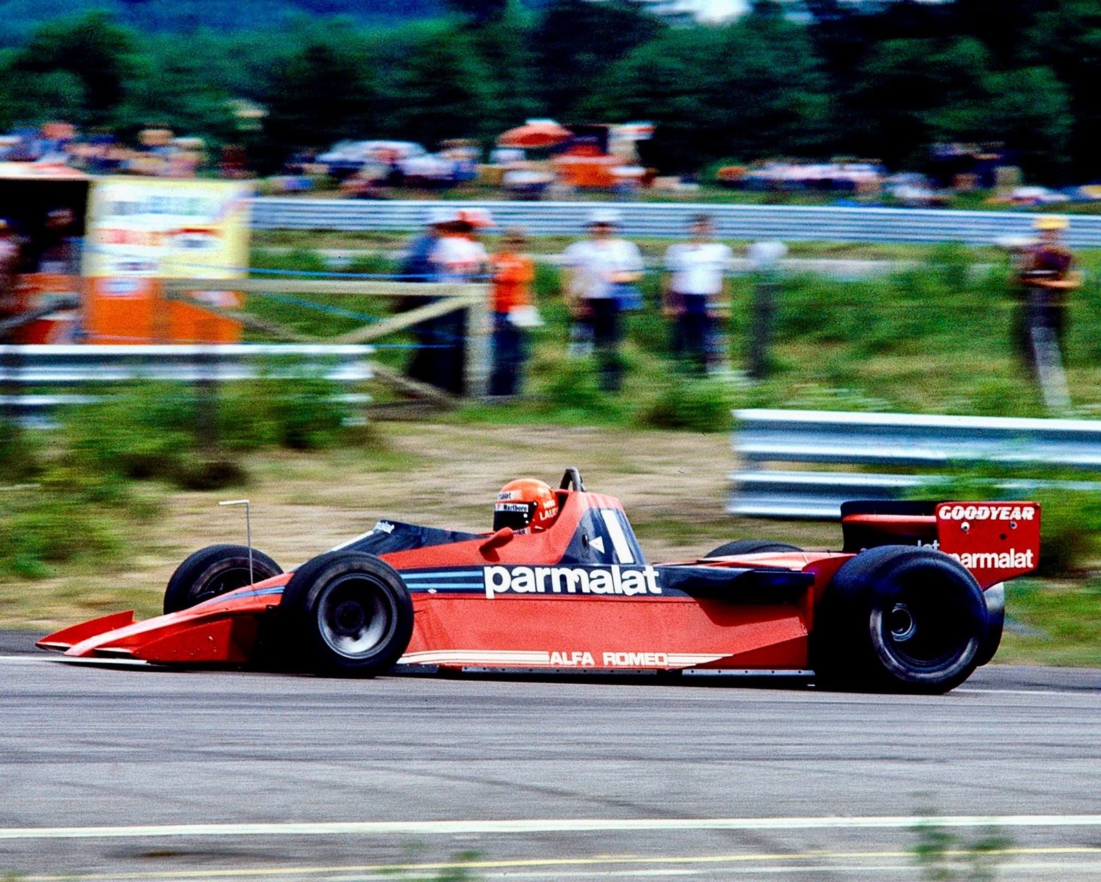
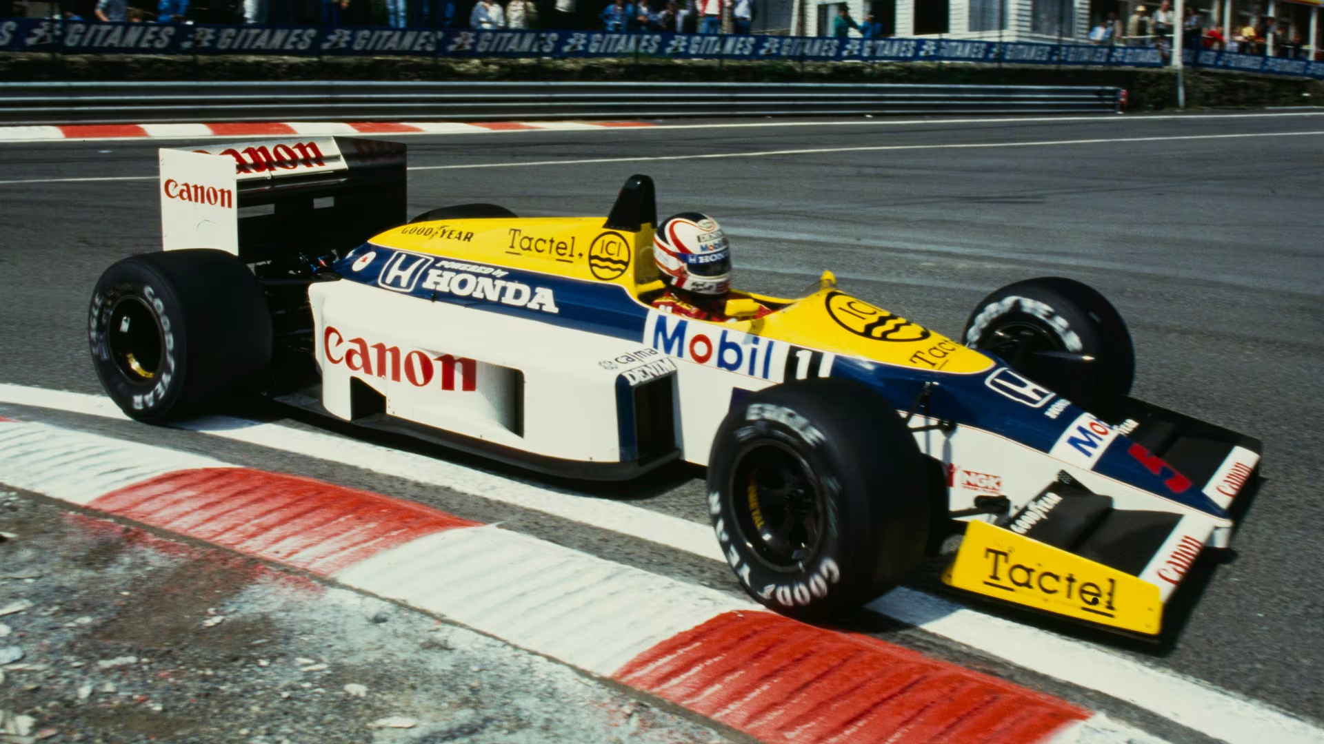
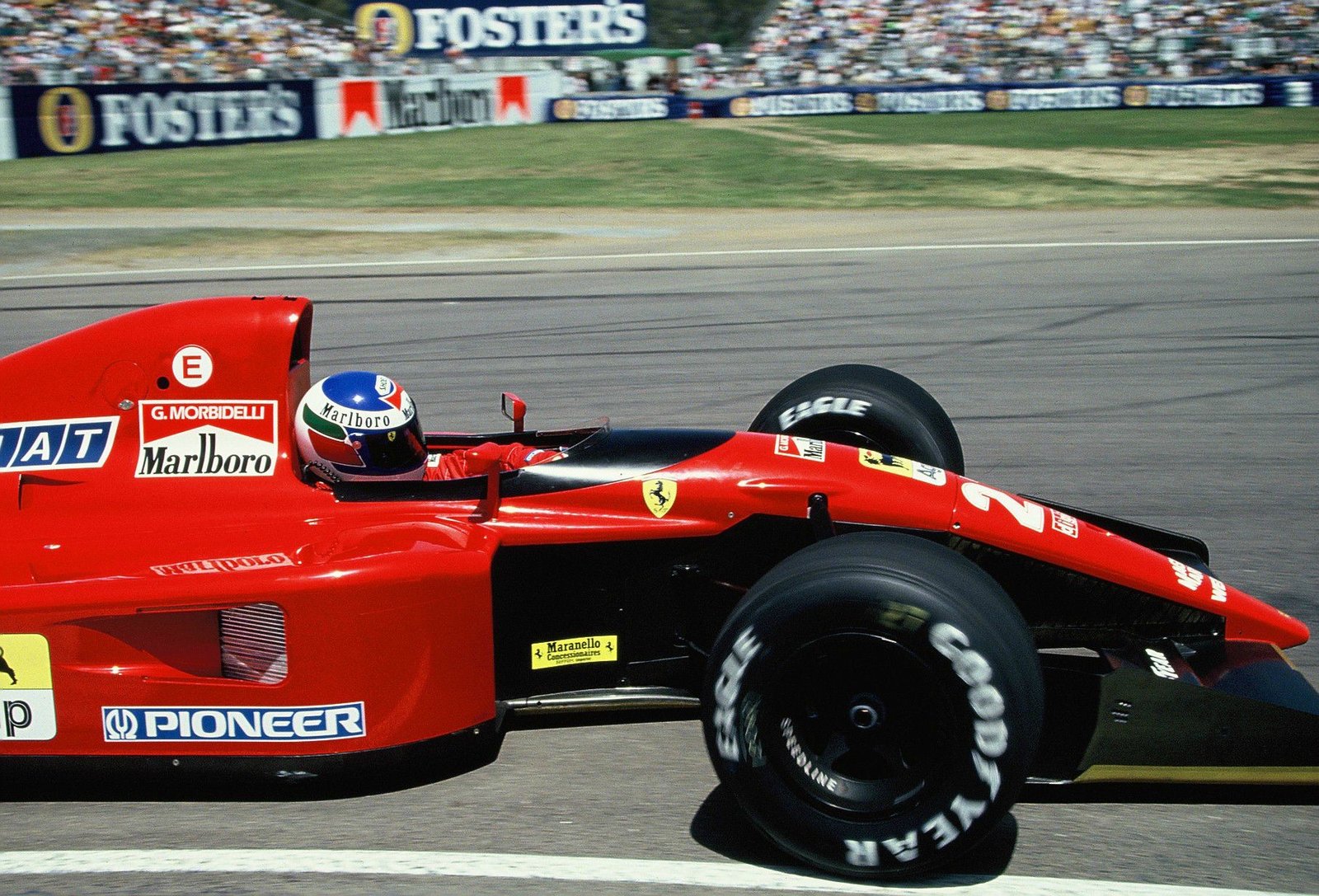
The seventies arrived at a moment when national identity gave way to commercial ambition. Tobacco brands entered the sport with the confidence of couture houses. They did not treat the car as a billboard. They treated it as an object worth dressing properly. Martini stripes followed bodywork like tailored fabric. Gold pinstripes traced architecture rather than fighting it. The car became moving theatre.

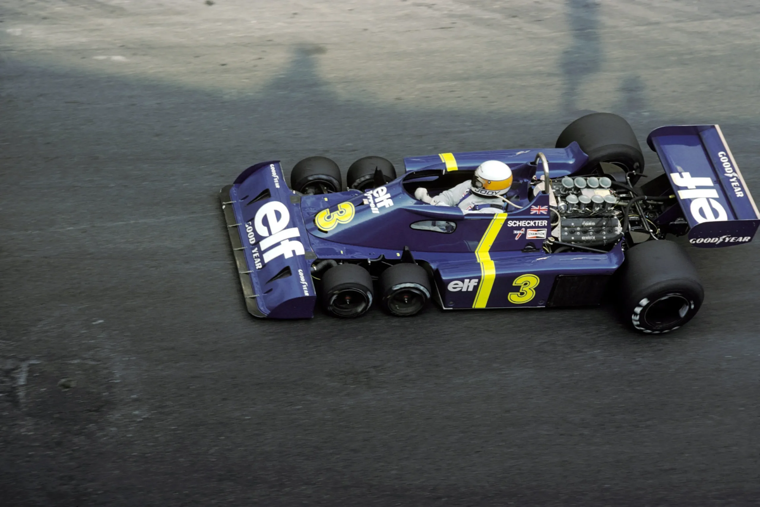
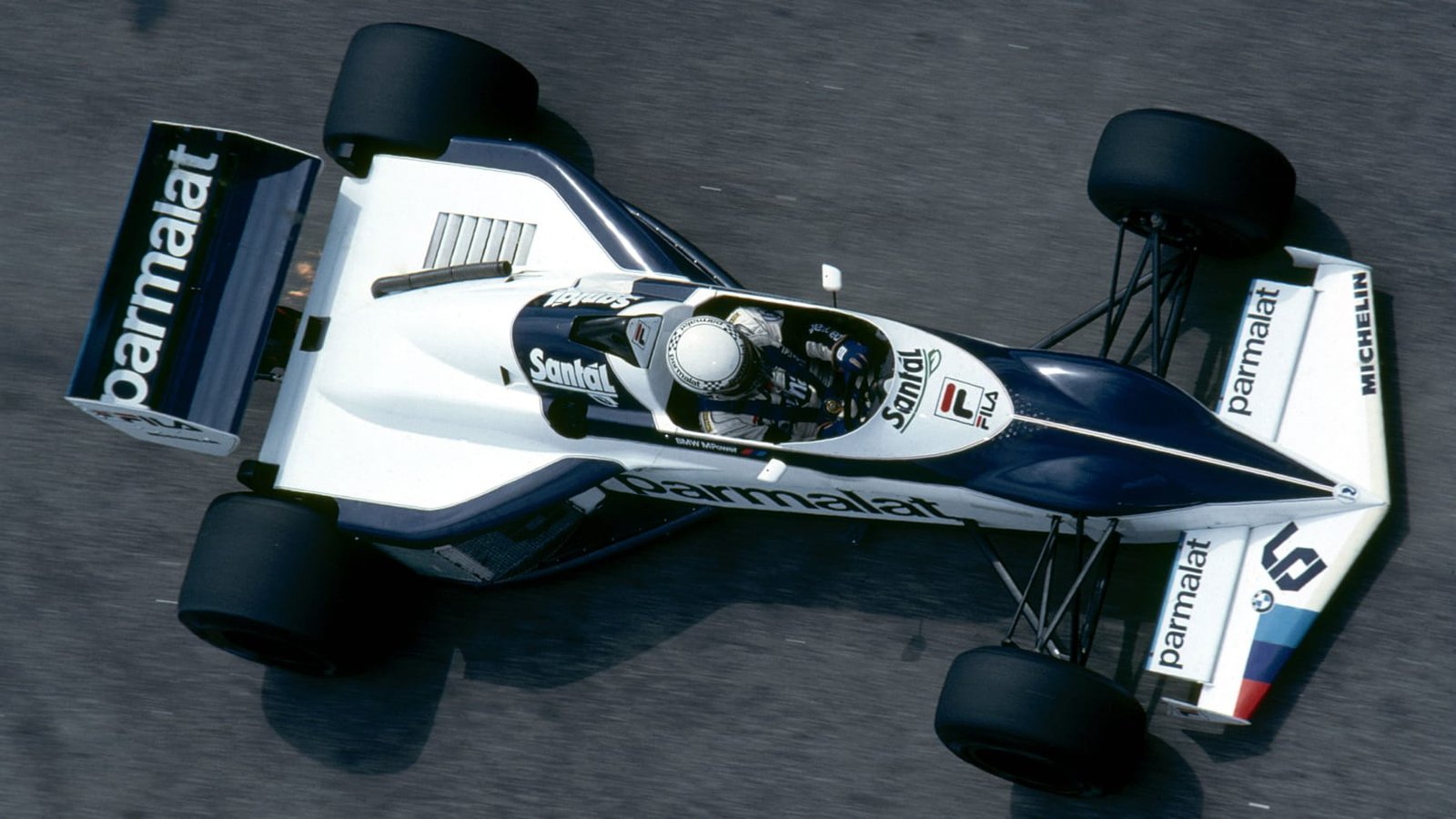
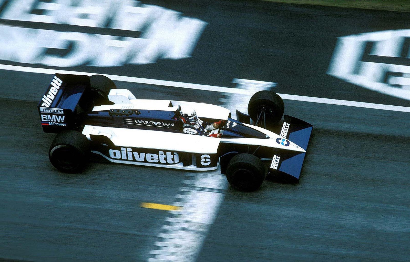
The eighties sharpened everything. Turbo engines lowered the stance of the machines and stiffened their attitude. Advertising culture grew bolder. Graphic language turned more assertive. Hard splits. Clear hierarchy. Strong contrast. Formula 1 reflected the visual confidence of the era.

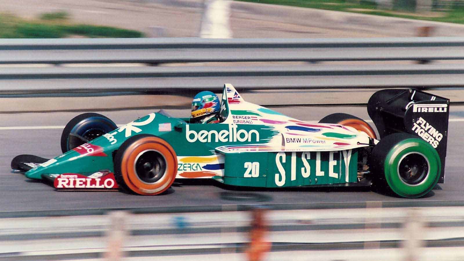
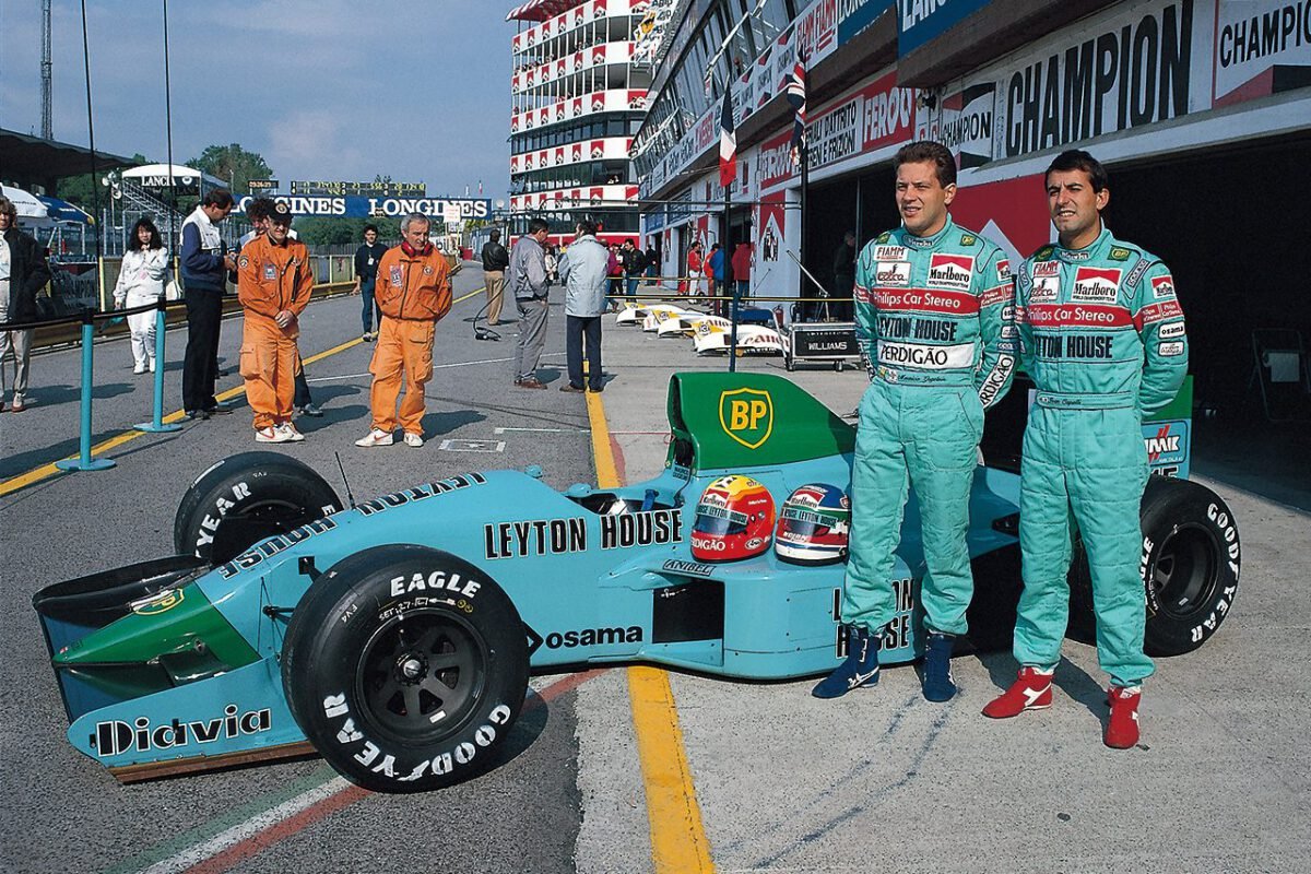
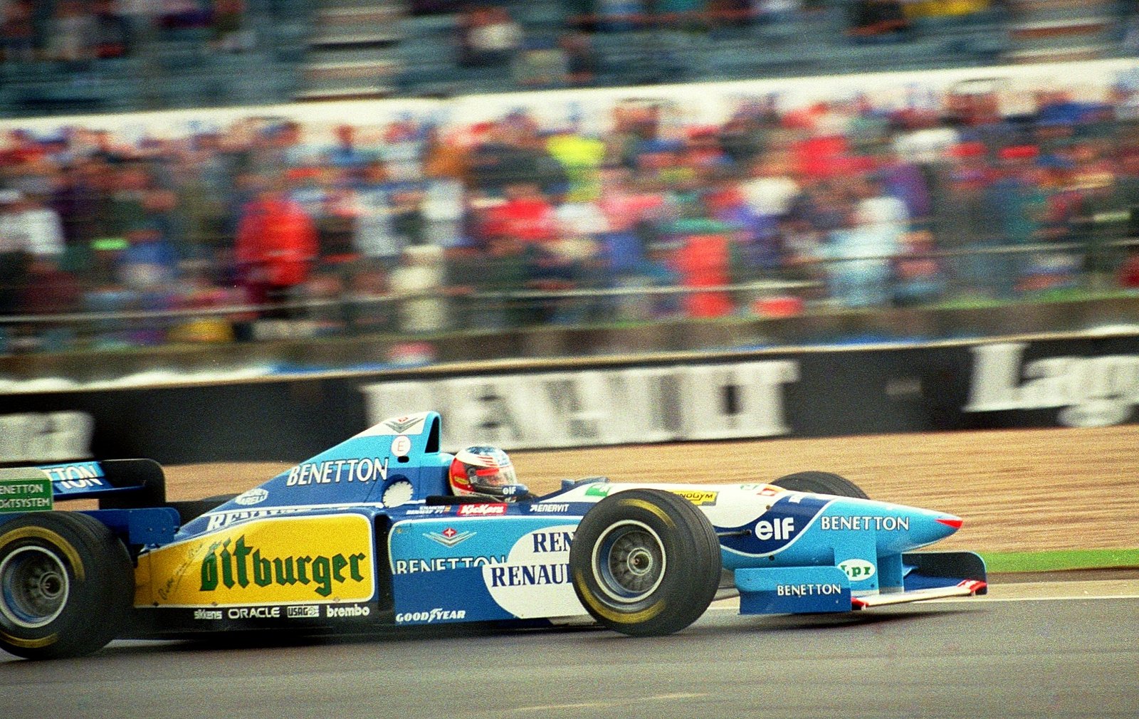
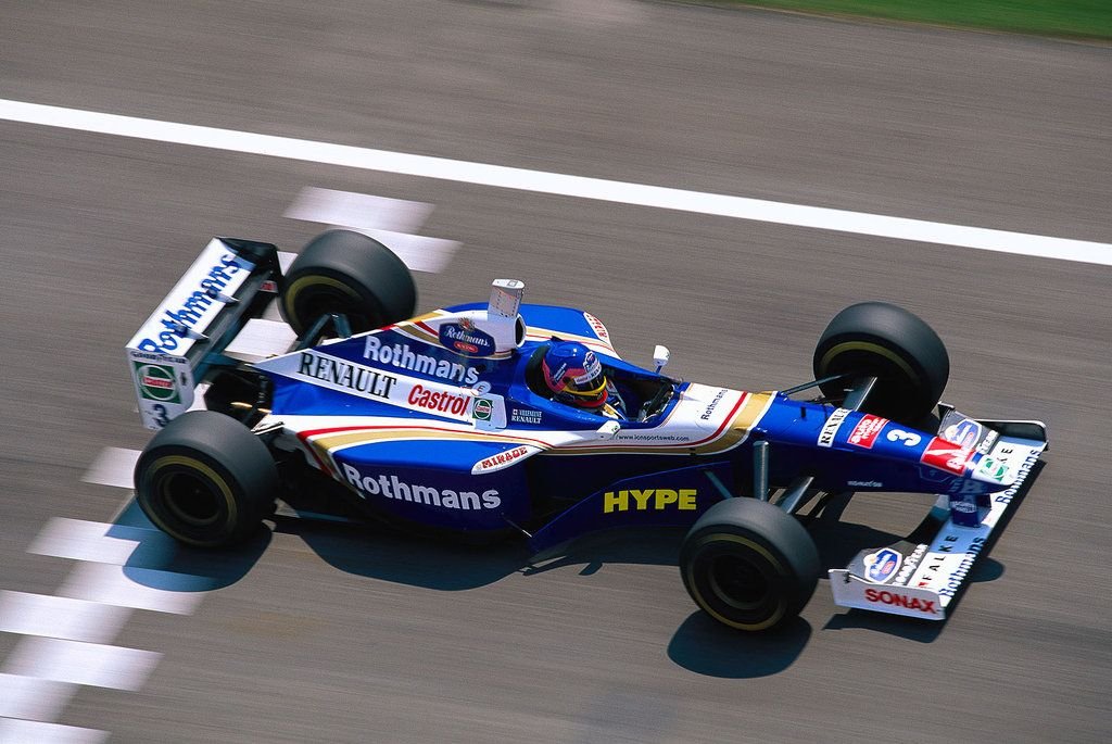
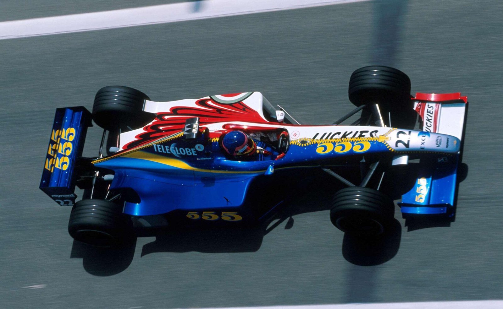
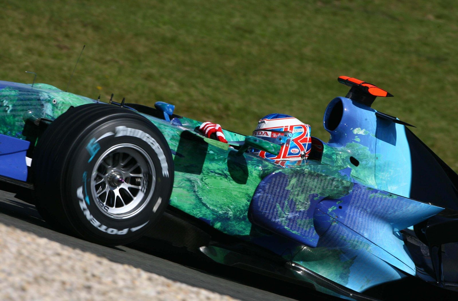
The nineties loosened the collar. Colour returned with optimism. Television expanded. Fashion and technology brands entered the paddock. Teal, neon green, saturated blues. The sport felt global in a new way, and its visuals followed.

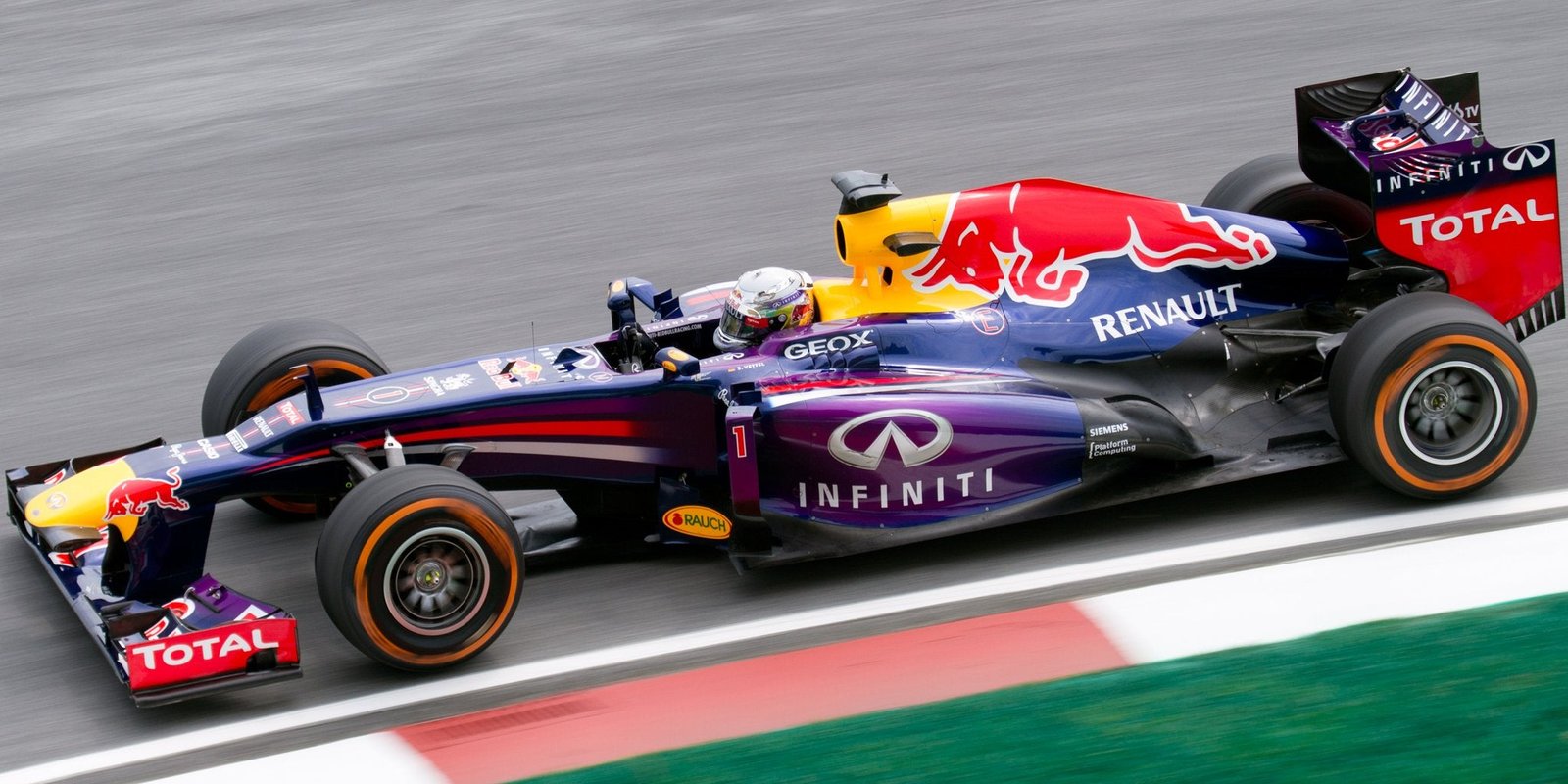
Modern Formula 1 operates under different pressures. Aerodynamic surfaces are layered and fragmented. The halo alters the centre of gravity visually as much as physically. Carbon fibre is often left exposed, deepening the tone of the grid. Sponsorship is diversified, meaning identity must now negotiate multiple partners at once. Design teams today are more analytical and more deliberate than ever before.

The canvas, however, is denser.

Older cars often appear seductive because the eye could read them in a single glance. Modern cars reward a slower gaze. Their beauty lives in detail rather than silhouette.

To understand how that visual language evolved, it helps to revisit the eras where culture, engineering and identity aligned in particularly striking ways.

1968: When Colour Became Strategy

The Lotus 49B did not just carry a new engine specification in Spain in 1968. It carried a new visual logic. British Racing Green gave way to the red, white and gold of Gold Leaf Tobacco, and with it Formula 1 stepped into the age of commercial identity.

The car was still unmistakably a Lotus. The long nose, slim body and exposed suspension all remained. But the colour was no longer inherited from nationality. It was chosen by a sponsor. Logos were no longer an afterthought. They became part of the car’s design.

What had once been national colour schemes were suddenly brand identities.

Lotus 49B – Gold Leaf (1968)

The red, white and gold palette was simple but striking. A white nose cone broke up the bodywork before the deep red sides and gold accents carried the eye back toward the engine cover. The Gold Leaf logo sat cleanly on the sidepods without clutter.

It looked modern without feeling forced. For the first time, a Formula 1 car looked deliberately styled rather than simply painted.

From that moment on, colour became part of the competition.


The Seventies: Identity Becomes Intentional

By the early seventies, sponsorship was no longer an experiment. It was the visual language of the sport.

Teams began treating liveries as something to design rather than simply apply. Colours were chosen to emphasise shape, logos were positioned carefully, and the car itself became part of the branding.

Lotus 72 – John Player Special (1970–75)

The black and gold John Player Special Lotus remains one of the most recognisable Formula 1 liveries ever created.

The glossy black bodywork allowed the gold pinstriping to trace the edges of the car’s wedge-shaped body. The typography sat low and clean along the sidepods. At night races and in low light it looked almost luminous.

It felt expensive, theatrical and unmistakably seventies.


Tyrrell P34 – Elf (1976)

The six-wheeled Tyrrell P34 could easily have looked ridiculous. The Elf livery helped ground it.

A deep blue base was broken by clean bands and simple sponsor placement. The extra pair of front wheels gave the car an unusual stance, but the graphics remained tidy and easy to read.

It is one of the few truly strange Formula 1 designs that still looked composed.


Tyrrell 009 – Elf (1979)

Where the P34 was experimental, the Tyrrell 009 was calm and balanced.

The deep blue bodywork and white striping felt perfectly proportioned, running cleanly across the sidepods and nose. The Candy logos were iconic without dominating the shape of the car.

It is a reminder that sometimes the most effective liveries are also the simplest.

Ferrari 312T2 – Ferrari / Agip (1976)

If the seventies were the decade when sponsorship began reshaping Formula 1, Ferrari remained a useful counterpoint. The 312T2 still wore the traditional Rosso Corsa red, broken only by the yellow Agip and Ferrari shields and a handful of white sponsor panels. Compared with the heavily branded cars beginning to appear elsewhere on the grid, it felt almost restrained.

What made the 312T2 memorable was the way the colour sat on the car’s distinctive shape. The low, flat airbox and broad sidepods gave the bodywork a strong horizontal stance, and the uninterrupted red made the silhouette easy to read. Even with the growing presence of sponsors, Ferrari still looked unmistakably like Ferrari.

ATS Penske PC4 (1977)

The Penske PC4 was striking for its restraint.

Painted almost entirely in bright yellow with minimal branding, the car relied on colour rather than graphics to make its impression. In a decade that was quickly embracing heavy sponsorship, the simplicity made it stand out.

It looked sharp, purposeful and unmistakable.


Brabham BT44 – Martini (1974–75)

Martini stripes are among motorsport’s most famous design elements, and the BT44 wore them perfectly.

The red and blue bands flowed naturally along the white bodywork, following the curves of the sidepods and nose rather than cutting across them. The result felt integrated rather than applied.

Few liveries have aged this gracefully.


Brabham BT46 – Parmalat (1978)

The Brabham BT46 wears its Parmalat colours in a clean horizontal layout that suits the car’s long, low body.

A deep red dominates the chassis, broken by a dark blue band running through the sidepods with the bold white Parmalat lettering sitting squarely in the centre.

The typography does a lot of the work here. The soft, rounded Parmalat wordmark feels unmistakably seventies, while the delicate Alfa Romeo script along the lower body adds a touch of Italian elegance. It’s a simple composition, but beautifully balanced.


The Eighties: Geometry and Power

Turbocharged engines did more than alter speed. They altered posture. Cars became tighter at the waist, more angular in stance, and visually aggressive. Liveries responded in kind. Geometry sharpened. Contrasts intensified. Branding became assertive rather than decorative.

Brabham BT52 – BMW (1983)

The BT52 felt purpose built for its white and blue division. The colour split across the bodywork was not decorative. It echoed the wedge shaped chassis itself.

The sharp angles of the car made the colour break feel architectural rather than ornamental. It was branding that respected structure.


Brabham BT55 – BMW Lowline (1986)

The Lowline remains one of the most visually radical silhouettes in Formula 1 history. Flattened and elongated, it appeared almost uncomfortable in its stance. The oiivetti logos stretched across the body in a way that emphasised its horizontal drama. The graphics did not fight the engineering. They amplified it. Change the proportions and the colour tells a different story.


Benetton B186 (1986)

Even before the nineties fully arrived, Benetton signalled the shift. The B186 wore colour like a statement piece. Green, yellow and blue brushed across white bodywork with energy that felt imported from fashion rather than fuel.

The B186 introduced Benetton’s unmistakable visual identity to Formula 1. It was bright, modern and completely different from the more conservative palettes surrounding it on the grid.


McLaren MP4/4 – Marlboro (1988)

Few liveries are as immediately legible as the red and white Marlboro McLaren. The strength lies in its simplicity. A clean horizontal divide. Crisp block typography. No unnecessary intervention. The red is placed with intent, the white balancing it perfectly.

Even in motion, it reads clearly from distance. It remains perhaps the clearest example of sponsor led hierarchy executed without compromise.


Williams FW11 – Canon (1986)

The Canon Williams carried a bold primary palette that felt commercial but interesting. Blue and yellow wrapped around white bodywork with clarity and contrast. The proportions of the car allowed the colours to settle naturally.

The bright red Canon wordmark sits boldly across the sidepods, immediately readable even from a distance. It’s a straightforward scheme, but the contrast between white, blue and red gave the Williams a strong presence.


Leyton House March 881 (1988)

Teal should not have worked in Formula 1. Yet the 881 remains one of the most striking cars of its era. The colour was cool and unexpected, standing apart from the saturated reds and blues around it.

Its uniqueness gave it longevity. It felt modern before modern was fashionable.


Onyx ORE-1 (1989)

Blue and white punctuated with pink accents, the Onyx livery carried late eighties experimentation into sharper territory.

It felt confident, slightly disruptive and comfortable with contrast. There was edge without chaos.


The Late Nineties: Optimism in Colour

If the eighties were about discipline, the nineties were about personality. Sponsorship broadened. Consumer brands entered the paddock. Liveries became expressive, playful and at times excessive. But rarely forgettable.


Benetton B195 (1995)

The B195 carried one of the most distinctive colour schemes of the mid-nineties. A deep navy blue forms the base of the car, while lighter turquoise tones sweep over the cockpit and engine cover before dropping into sponsored sidepods.

Thin lines separate the colours, giving the whole layout a sense of movement along the bodywork. From the side it feels energetic and unmistakably Benetton, a palette that stood apart from the more traditional schemes around it.


Ferrari 643 (1991)

The Ferrari 643 is classic Formula 1 minimalism. The entire car is wrapped in deep Rosso Corsa, broken only by a crisp white rear wing and small flashes of contrast around the cockpit and airbox.

From the side the shape does most of the work, the long nose and sculpted sidepods giving the red bodywork a sense of flow. It’s a livery built on restraint, relying on colour and proportion rather than graphic complexity.


Jordan 191 – 7UP (1991)

Few liveries capture nineties optimism like the Jordan 191. That luminous green was fresh, almost rebellious against established palettes. The 7UP branding felt youthful and light, reinforcing the sense that this was a team unburdened by history.

It remains one of the most photographed cars in Formula 1 not because of dominance, but because of vibrancy.


Williams FW19 – Rothmans (1997)

By the late nineties, Williams had settled into a visual identity that was instantly recognisable. The FW19 carried the Rothmans palette of deep blue and white, separated by thin gold striping that gave the car a touch of elegance without overcomplicating things. A white nose led into dark blue bodywork around the cockpit and engine cover, creating a clear and balanced colour split.

The Rothmans typography was large but neatly integrated, sitting naturally along the sidepods rather than fighting for space. Small red accents and the gold detailing softened the otherwise corporate palette. It was a straightforward, confident design for a team that was quietly dominating the championship.


Jordan 199 – Buzzin Hornets (1999)

By the end of the nineties, Jordan had fully embraced its bright yellow identity, and the 199 pushed it further with the playful “Buzzin’ Hornets” theme.

The vivid yellow bodywork is broken up by bold black hornet graphics that stretch across the sidepods and engine cover, giving the car real personality


BAR 01 – Split Livery (1999)

The BAR 01 became famous before it even turned a wheel. The team originally planned to run two different liveries, one for each of its main sponsors, before regulations forced a compromise.

The solution was a single car split down the middle, with one half carrying the white and red Lucky Strike colours and the other the deep blue and yellow 555 scheme. From the side the contrast is striking, a Formula 1 car that quite literally wears two identities at once.

The nineties may have flirted with excess, but they were rarely dull. Colour returned with confidence.


The 2000s: Corporate Precision

The early 2000s felt engineered in every sense. Branding matured into multinational uniformity. Metallic finishes caught light differently. Cars looked expensive in a new way. High-definition broadcasting and global sponsorship deals meant liveries now had to read as clearly on screen as they did trackside.

Renault R25 – Mild Seven (2005)

Blue and yellow returned with refined energy. The transitions were smoother, the surfaces more sculpted, and the palette felt playful. In an era of increasingly complex bodywork, the R25 retained clarity from distance.

It balanced vibrancy with discipline.


McLaren MP4-21 – Chrome (2006)

When McLaren unveiled its full chrome finish, it changed how a Formula 1 car interacted with light. Under floodlights, the bodywork reflected the circuit back at itself. The surface became dynamic, shifting tone with every camera angle. It was not simply silver. It was engineered reflectivity.

In an era of improving broadcast technology, chrome felt deliberate. The car was designed as much for television as for trackside presence.


Ferrari F2004 (2004)

By the early 2000s, aerodynamics had grown more intricate, yet the F2004 retained visual clarity. The red was deeper and richer. The surfaces were complex but legible.

From distance, it still read simply as Ferrari.


Honda RA107 – Earth Livery (2007)

In a grid dominated by tobacco heritage and corporate symmetry, Honda removed its title sponsor and wrapped the car in a satellite image of the planet. Continents stretched across sidepods. Oceans curved over the engine cover.

There was no conventional logo hierarchy, no dominant brand colour. It was a statement as much as a livery. Whether beautiful or not depends on perspective. But it was undeniably ambitious.


Brawn GP 001 (2009)

The BGP 001 looked almost unfinished when it first appeared. A stark white base was broken only by flashes of fluorescent yellow and thin black striping sweeping back from the nose toward the cockpit. With almost no sponsor clutter, the car had the feel of a testing livery rather than a polished race design.

It was unusual more than conventionally beautiful, but that stark simplicity made it instantly recognisable during Brawn’s improbable championship season.


Red Bull RB9 (2013)

By 2013 the Red Bull livery had become one of the most recognisable in Formula 1. The RB9 used a matte dark navy finish that absorbed light rather than reflecting it, giving the car a distinctive look on television and in photographs.

The large red and yellow charging bull graphic stretches across the air intake, while the bright yellow nose provides a strong focal point at the front. It’s a branding-led design, but one executed with consistency.


The Cycle Turns Again

With new regulations and new entrants arriving in 2026, the grid feels poised for another alignment. Audi brings clarity. Cadillac brings boldness. A Newey shaped Aston promises proportion and discipline. Regulation resets invite aesthetic reset.

The shapes evolve. The halo remains. Surfaces fracture and reform. Yet the instinct to dress a racing car in something unmistakable endures.

The fastest cars are remembered in record books.
The most beautiful linger in the mind.

Your next Read

With little seat time thus far, but a vague idea of what I’m dealing with, …

A Journey of Discovery Sok’s path to becoming an artist was not straightforward. “Before pursuing …

Lace-trimmed tanks shimmered beneath the vaulted ceilings of the Musée Rodin as Dior’s Fall 2026 …

January in Tamworth is always a gamble. The heat hangs heavy. Car doors sear your …